
In 2020, I wrote my thesis where I created a turbidity risk index for seagrass beds in Tsimipaika Bay in northwestern Madagascar. In the beginning of my research I used GEBCO data to observe the bathymetry of the area. Below is the code I used.
What’s next? Plotting a 3D surface model from the data. After converting the netCDF data to dataframe, I couldn’t create a 3D plot. So this can be the next challenge.
Sources
Data Download
Import and Check the Data
1
2
3
import xarray as xr
import os
import pandas as pd
1
2
# reads a single netCDF file
da = xr.open_dataset('/Users/nat/Desktop/Geo_Projects/GEBCO/Input/GEBCO_Northwest Madagascar/gebco_2021_n-11.800086853778835_s-14.190019295022976_w45.94407106576158_e49.25297672806889.nc')
1
2
# print dimension names of the data array
da.dims
1
Frozen({'lat': 574, 'lon': 794})
1
2
# variables in the dataset
da.data_vars
1
2
Data variables:
    elevation  (lat, lon) int16 ...
1
2
3
4
5
6
7
# create a list of the coordinates of a given dimension of the data array as a python list
# limiting to the first 3 items
# Some notes
#  "xarraydataarry.values > ".values" converts to a numpy array
#  ".tolist()" is a method to convert the numpy array to a python list
#  list[0:3] or written as "list[:3]" displays list item number "0", "1", "2", "3".
da.coords['lat'].values.tolist()[0:4]
1
2
3
4
[-14.189583333333331,
 -14.185416666666669,
 -14.181250000000006,
 -14.177083333333329]
Subset and Plot
1
2
3
4
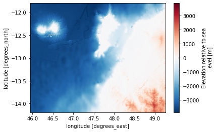
# select the variable and plot
da.elevation.plot()
plt.savefig('/Users/nat/Desktop/Geo_Projects/GEBCO/Output/Gebco_Ambanja1.jpg')
1
2
3
# plot a proflie across the grid at a given latitude
da.elevation.sel(lat=-12.4,method='nearest').plot();
plt.savefig('/Users/nat/Desktop/Geo_Projects/GEBCO/Output/Gebco_Ambanja2.jpg')

1
2
3
# Subset: selecting a region
da.elevation.sel(lon=slice(47,49),lat=slice(-14,-12)).plot(cmap='Spectral_r')
plt.savefig('/Users/nat/Desktop/Geo_Projects/GEBCO/Output/Gebco_Ambanja3.jpg')

1
2
3
4
5
6
7
8
9
10
11
12
13
# export the DEM profile to a csv making sure the columns are order by lon,lat,depth ie x,y,z

# create a pandas dataframe for a given index value the latitude nearest -13 degrees)
df = da.elevation.sel(lat=-13,method='nearest').to_dataframe(name='z')

# we don't need an index for x,y,z data
df = df.reset_index()

# renmae the column headers in the pandas dataframe
df.columns = ['x','y','z']

# print the top 5 rows
#df.head(5)
1
2
3
4
5
6
7
8
9
10
11
12
13
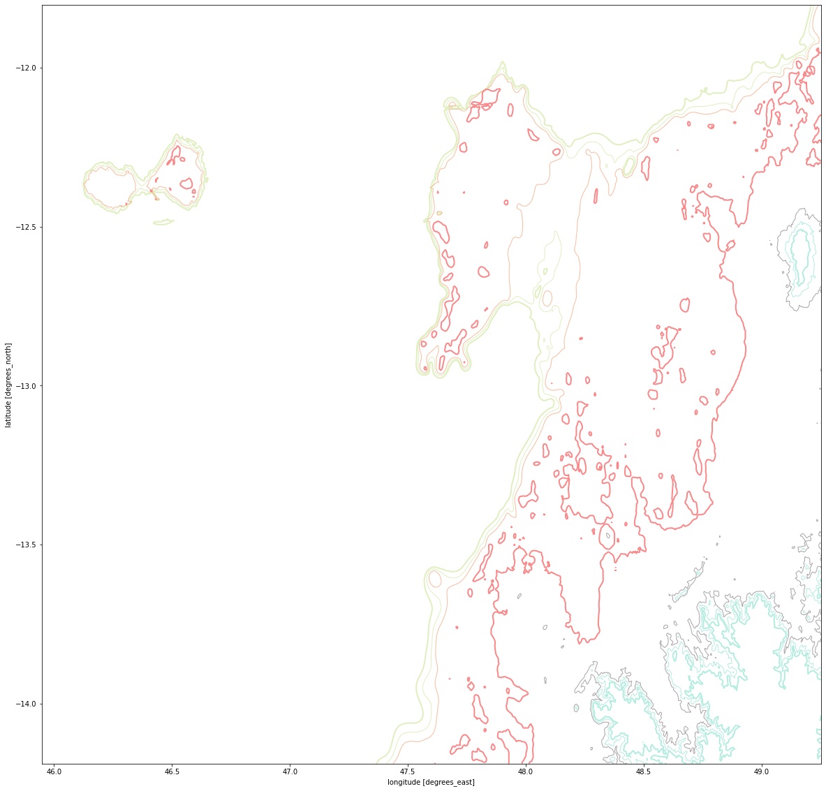
import matplotlib.pyplot as plt
# get funky with key word arguements (kwargs), e.g. with specifying lists of arguements
# note the number of items needs to stay the same between arguements.
# there's plenty of functionality, e.g. list colours accepting different types of input
# So here, three elevation contours are specifed, with different colours applied, and different line weights
#da.elevation.plot.contour(colors=['blue','#000000','r'],levels=[-1000,0,500],linewidths=[0.2,1,0.2]);
plt.figure(figsize=(20,20))
da.elevation.plot.contour(colors=['#e0efc0', '#e0efc0', '#f7be9e','#f88989', '#a7a5a5', '#b5ece0', '#b5ece0'],
levels=[-1000, -750, -500, 0, 500, 750, 1000],
linewidths=[2, 1, 1, 2, 1, 1, 2]);
plt.savefig('/Users/nat/Desktop/Geo_Projects/GEBCO/Output/Gebco_Ambanja4.jpg')
1
2
3
4
5
6
7
8
# plot a histogram of data values in the data array.
# Notes
#  * Use a semi-colon to prevent printing the array data out
#  * Instantiating the plot method will initalise the figure automatically

#da.elevation.plot.hist();

#da.elevation.sel(lat=-13,method='nearest').plot();
1
2
3
4
5
6
7
8
9
10
11
12
13
14
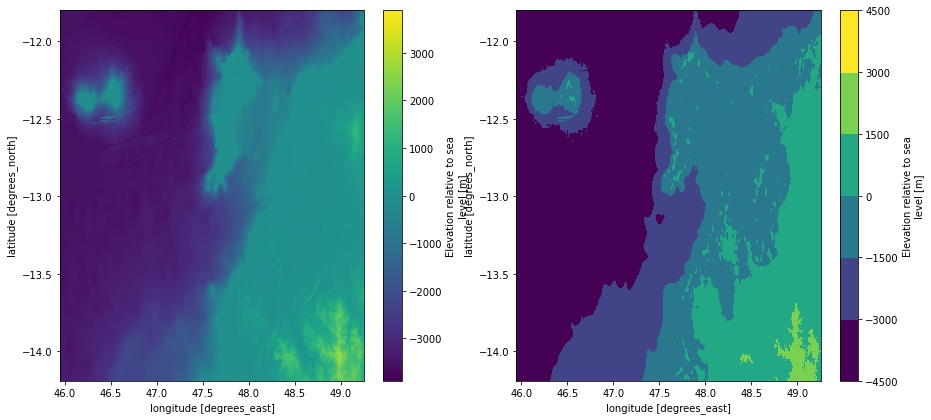
# create a figure object
f = plt.figure(figsize=(15, 15))
# plot 1
# plot with the xarray defaults
ax1 = f.add_subplot(2, 2, 1) # this adds a "subplot" (no. of rows, no of cols, index number)
da.elevation.plot(cmap='viridis');
# plot 2: plot with xarray default but specify a number of levels.
ax2 = f.add_subplot(2, 2, 2)
da.elevation.plot(cmap='viridis',levels=7);
plt.savefig('/Users/nat/Desktop/Geo_Projects/GEBCO/Output/Gebco_Ambanja5.jpg')
1
2
3
4
5
6
7
8
9
10
11
12
13
14
15
16
17
18
19
20
21
22
23
24
25
26
27
28
# create a figure object
f = plt.figure(figsize=(15, 15))

# plot 1
# plot with the xarray defaults
ax1 = f.add_subplot(2, 2, 1) # this adds a "subplot" (no. of rows, no of cols, index number)
da.elevation.plot.contourf()

# plot 2
# call the matplotlib pcolormesh plot type
# notice there are minimal defaults, no axis labels, no colorbar.
ax2 = f.add_subplot(2, 2, 2)
da.elevation.plot.contourf(cmap='viridis')

# plot 3
# plot with xarray filled contour plot
ax3 = f.add_subplot(2, 2, 3)
da.elevation.plot.contourf(cmap='terrain',levels=12)

# plot 4
# plot with xarray default but specify a number of levels.
ax4 = f.add_subplot(2, 2, 4)
da.elevation.plot.contourf(colors=['#333399','#4575b4','#74add1','#abd9e9','#e0f3f8','#c5f38d','#e2da89','#aa926b','#ffffff'],
                     levels=[-4000,-2000,-1000,-500,-100,0,500,1000,2000],
                     extend='neither'
                    )
plt.savefig('/Users/nat/Desktop/Geo_Projects/GEBCO/Output/Gebco_Ambanja6.jpg')

Linked Sources
- Thesis github page